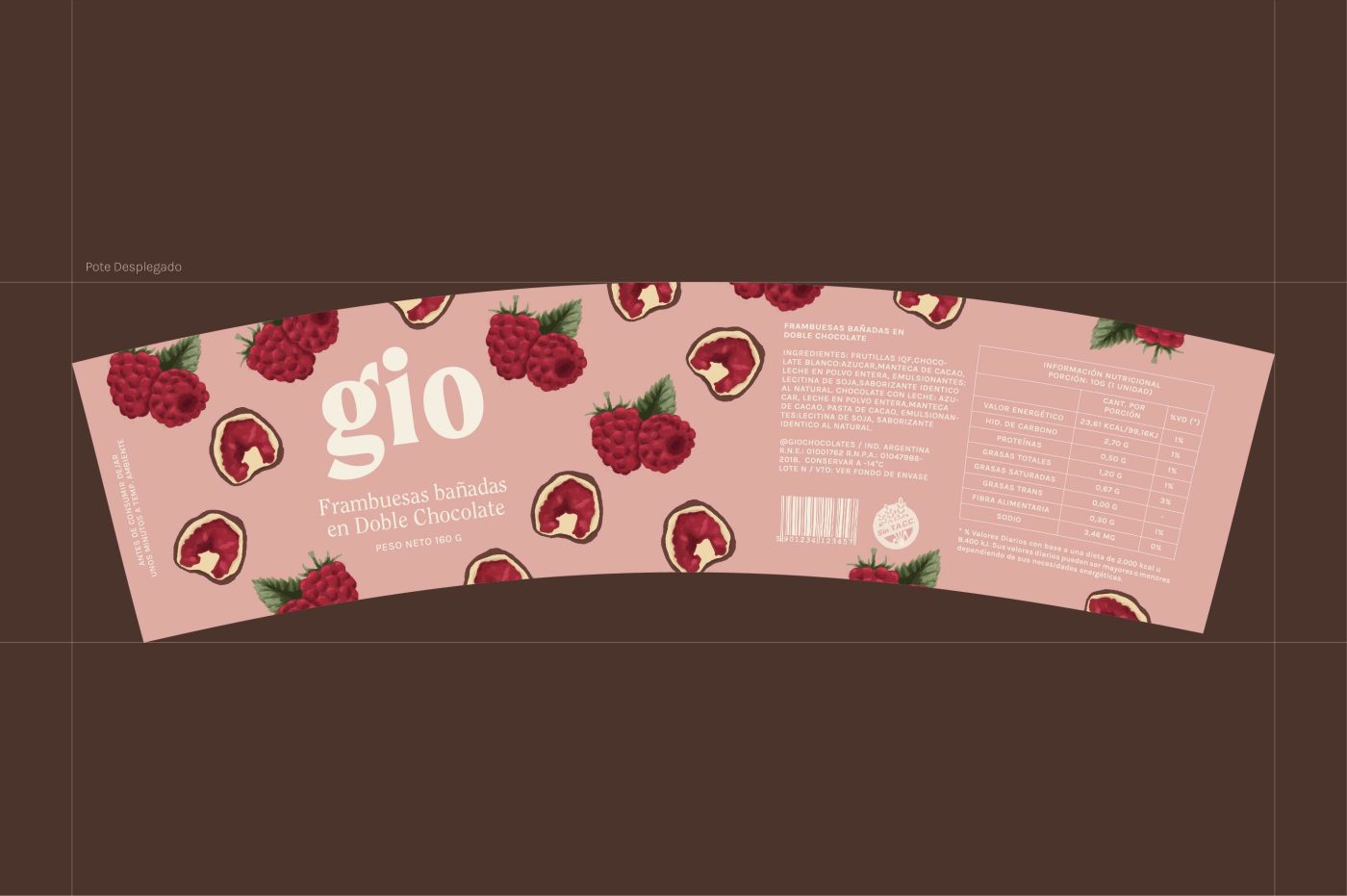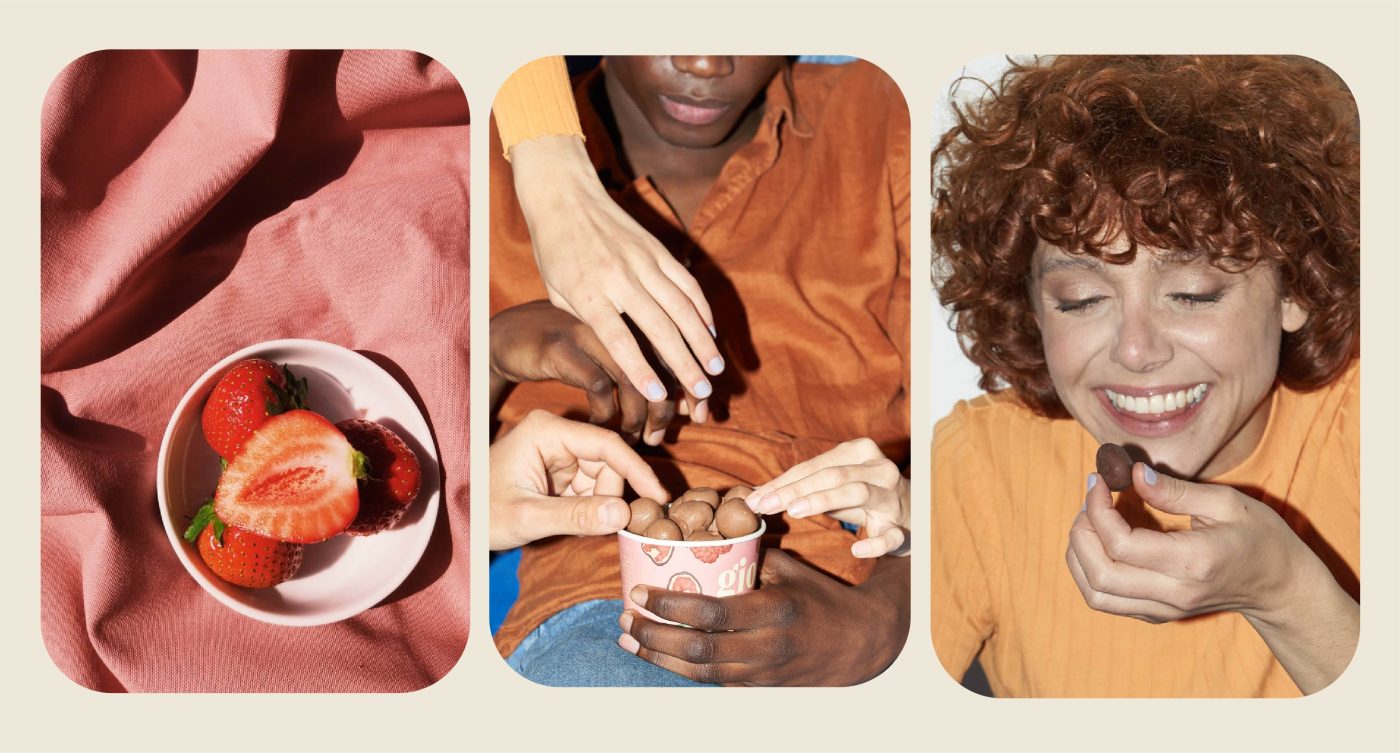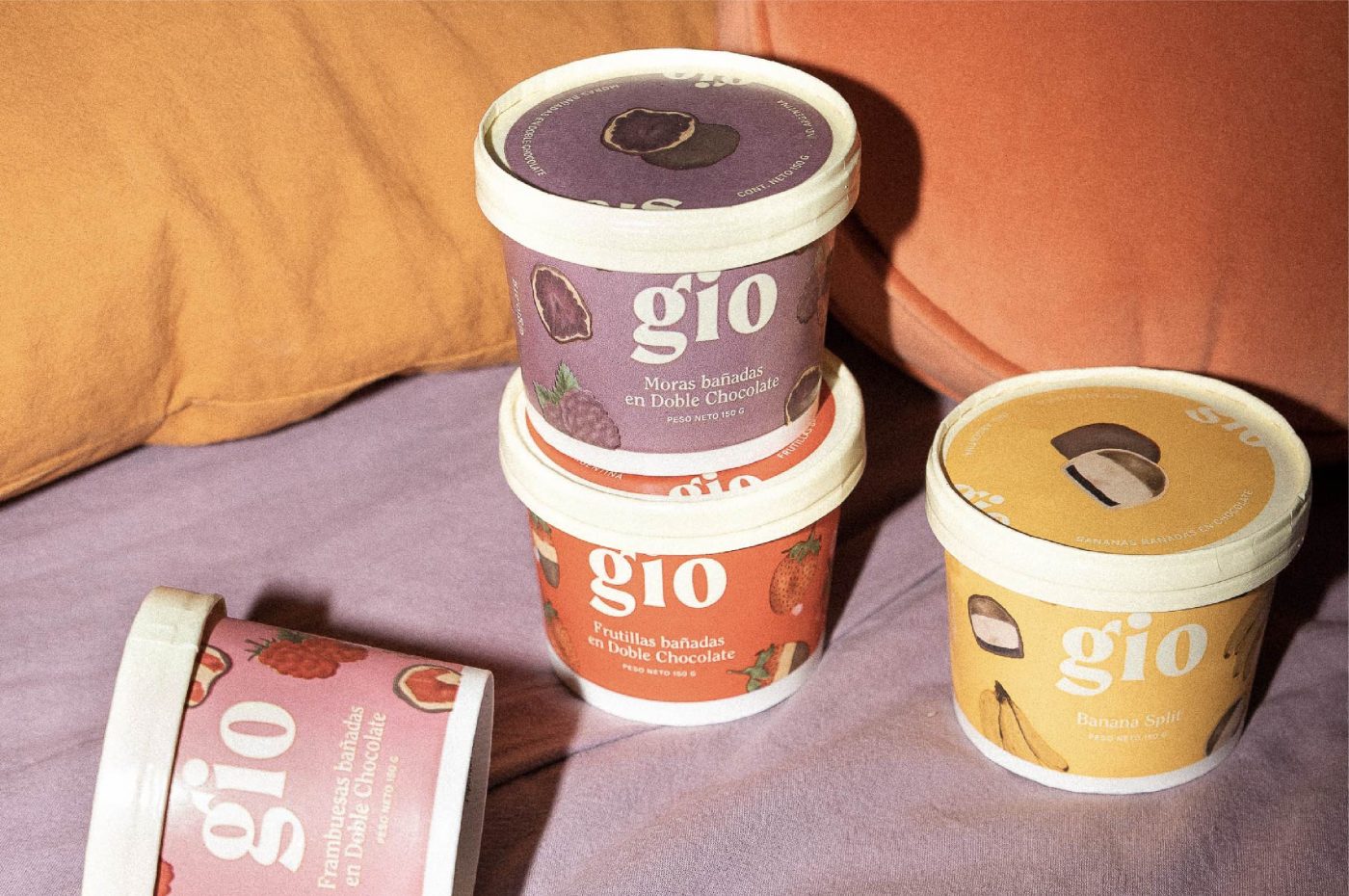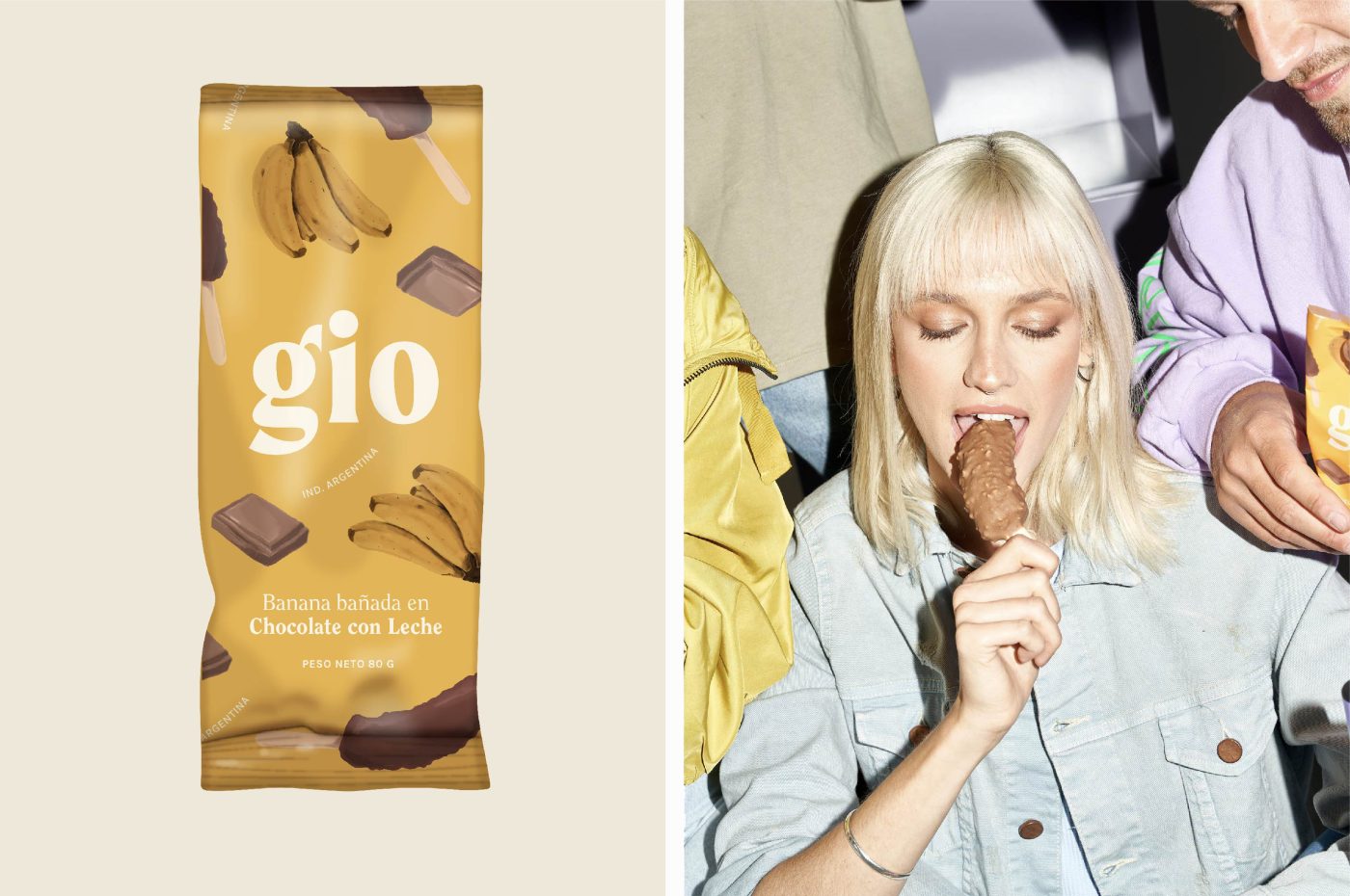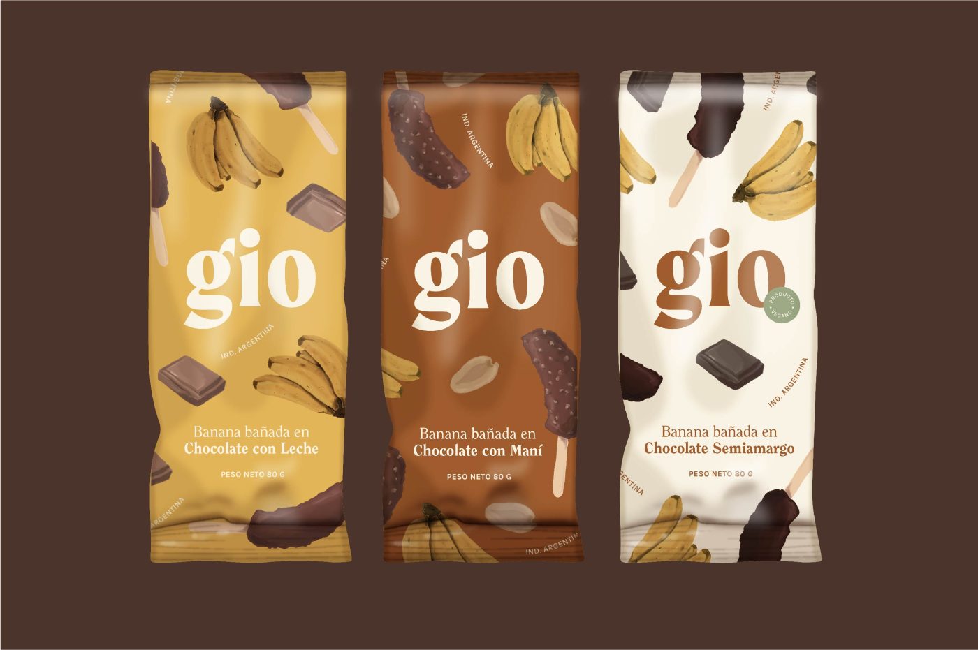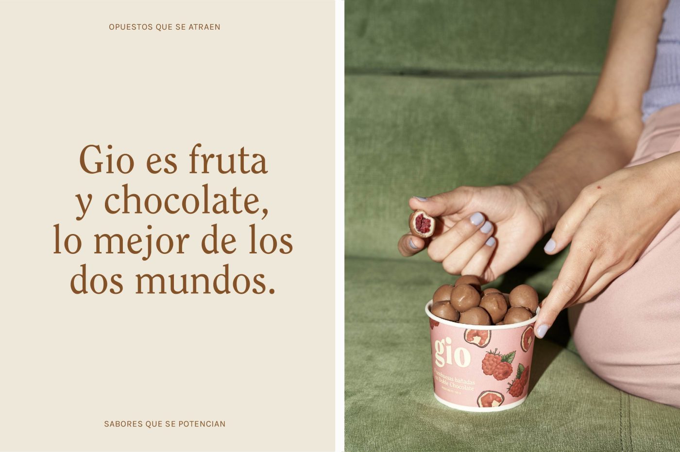
Gio is fruit and chocolate, the best of both worlds: opposites that attract themselves; flavors that enhance. In order to create the identity, we studied the universe of traditional chocolates and vintage illustrations. At the same time, we searched for present day consumption references. Friends on the couch, colors, short yet powerful phrases, a dose of irony. Brown ended up elected as the leading color, followed by a classic serif font, both contributing to a vintage and warm look.
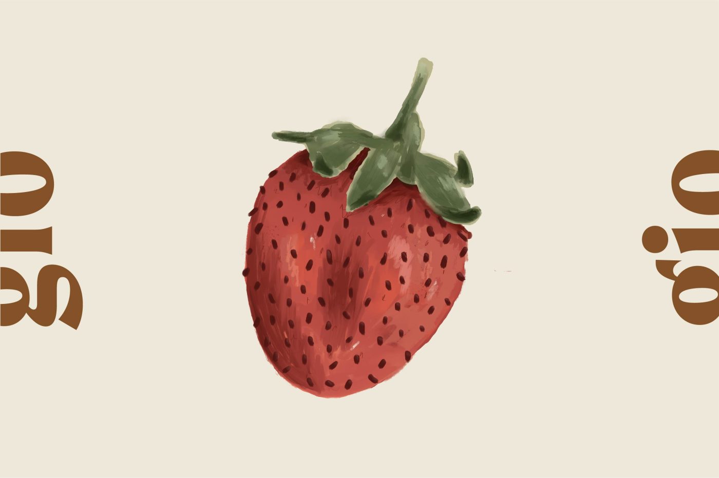
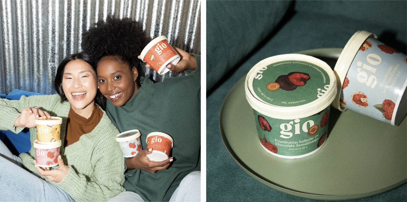
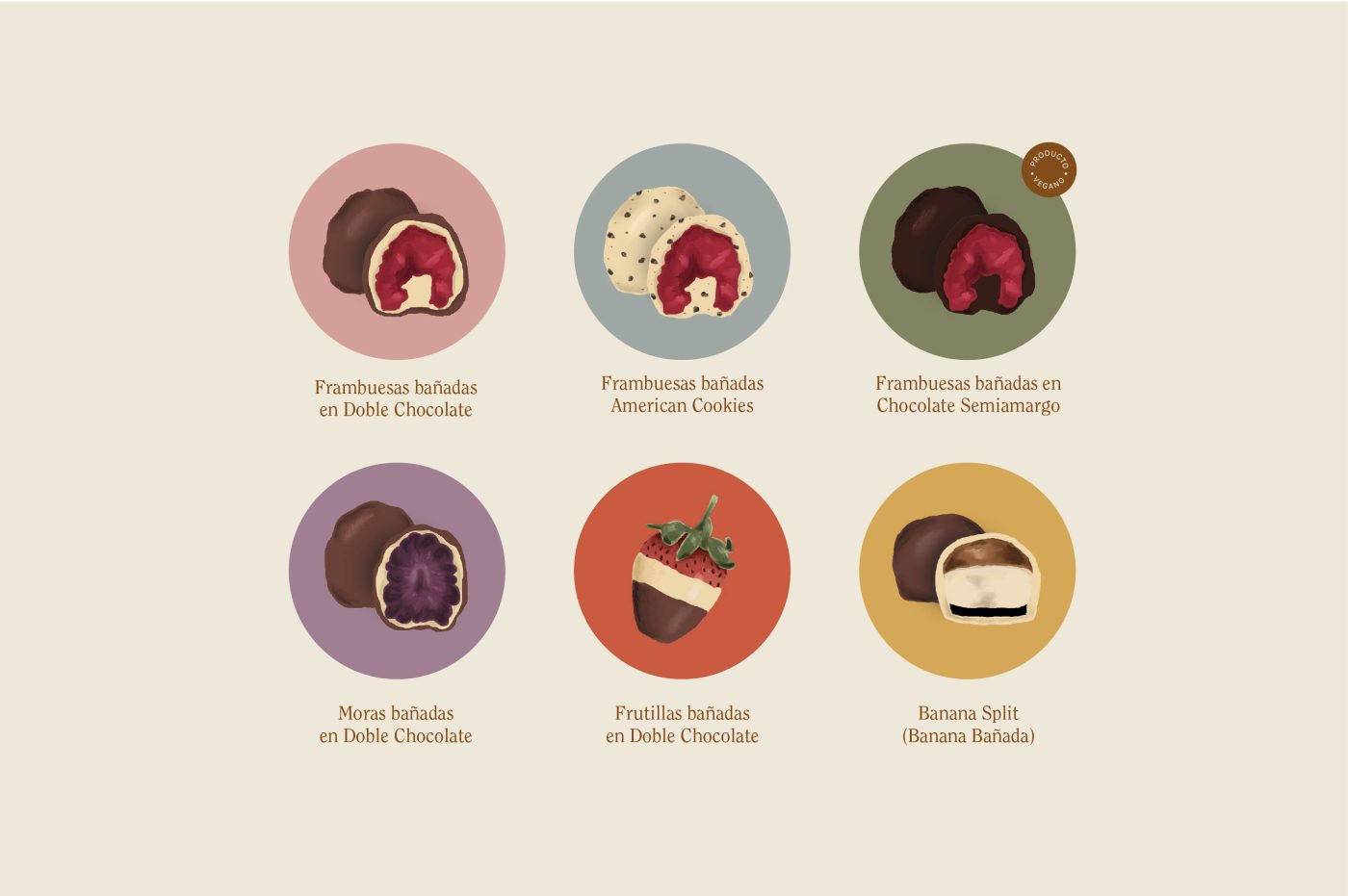
The super realistic illustrations we developed made it possible to present the products in the packaging without the need of using photographs. At the same time, we selected a wide variety of colors to distinguish and code each flavor, and also contribute to the playful spirit of the brand. Regarding photography, we tried to emphasize the union and contrast of the two worlds, using macros of chocolate and fruits textures. Also, we played with the “pleasure and freshness” statement, creating fun and easy-going situations between friends.