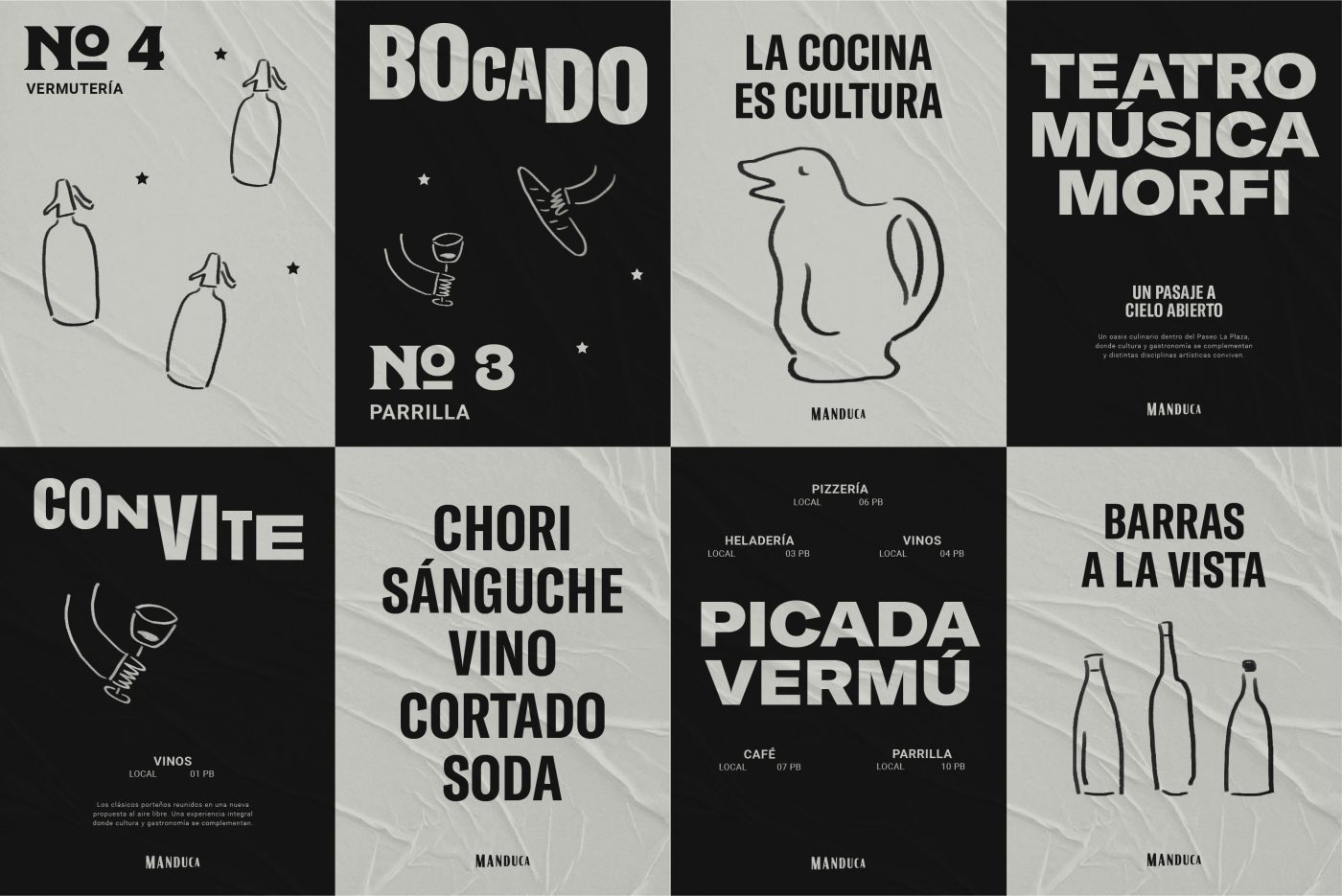
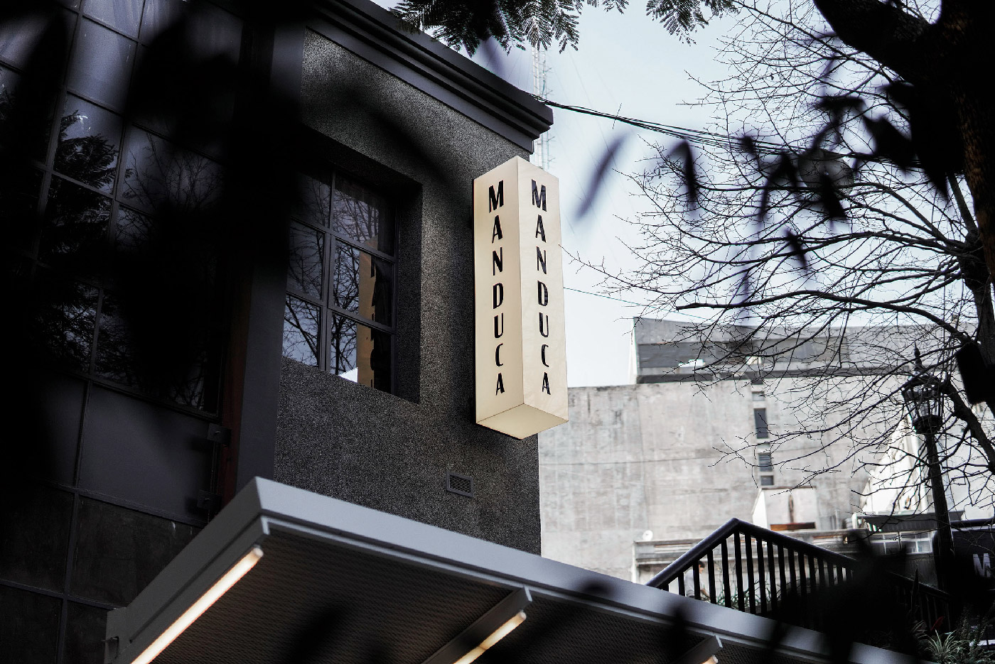
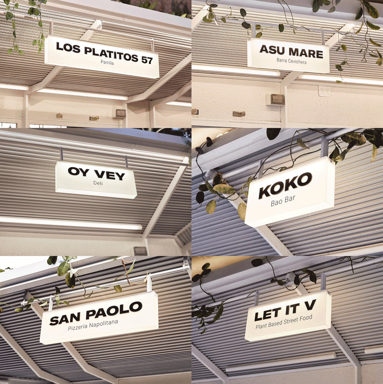
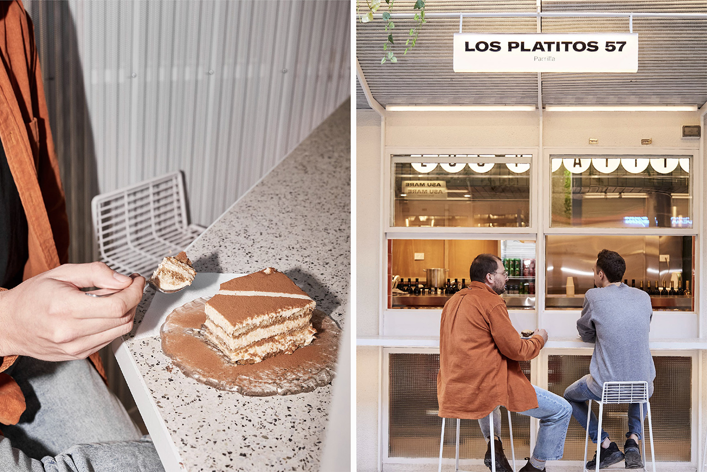
At the end of 2021 we were called to create an open air food court within the premises of Paseo La Plaza: a cultural center located in the City of Buenos Aires, in which both theatrical performances and various types of congresses and conventions are held, in addition to having gastronomic and commercial stores.
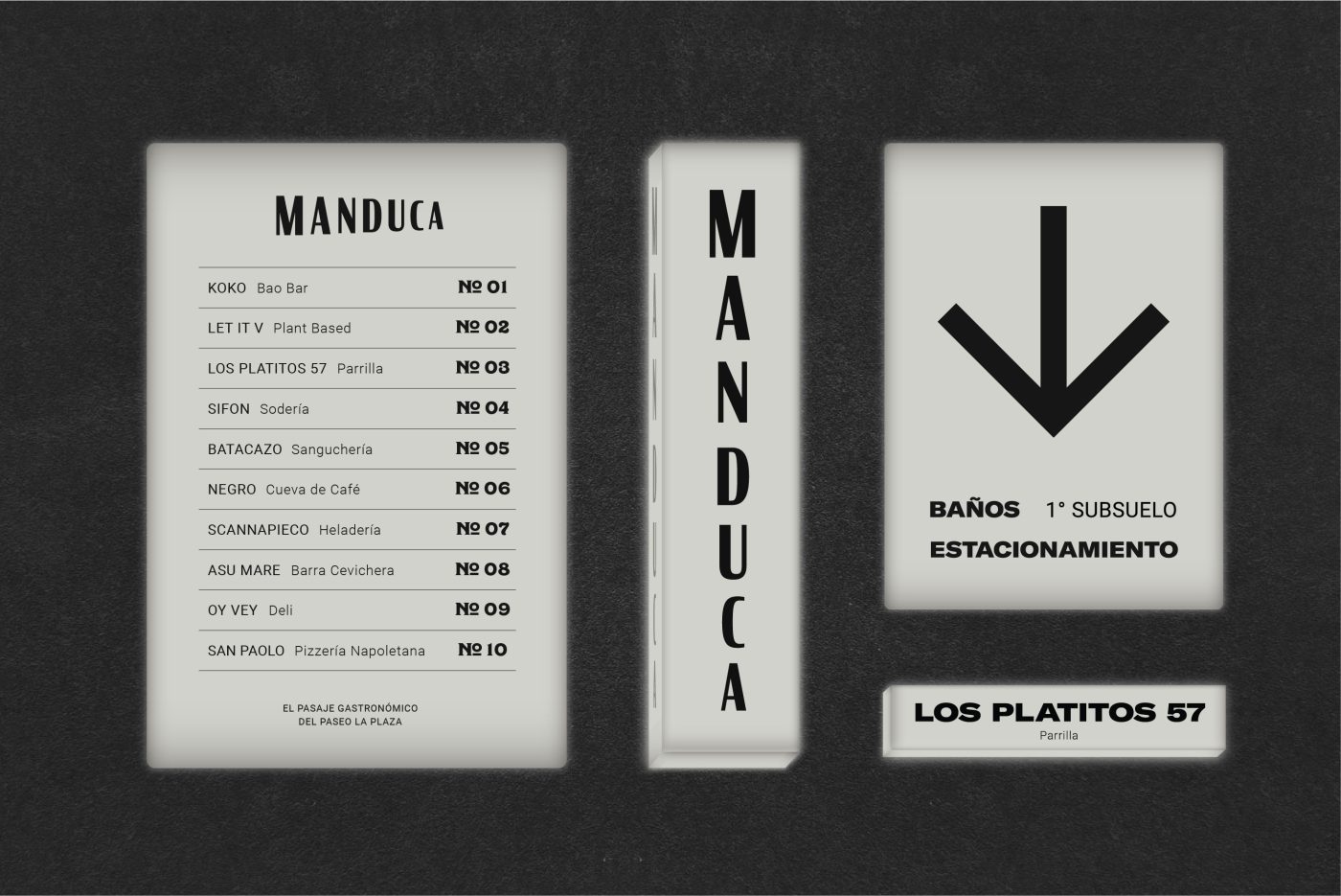
The Client’s initial wish was the following: on the one hand, to create an identity that could communicate the history of the place, its location in the heart of the emblematic “Avenida Corrientes” and its connection with the theater; and on the other hand, to be modern, minimalist and functional. The latter, referring to the need to have a brand that could be able to contain 10 different gastronomic proposals in the same space, each with its own identity.
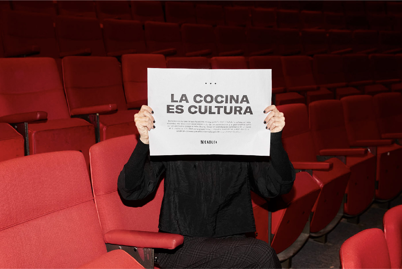
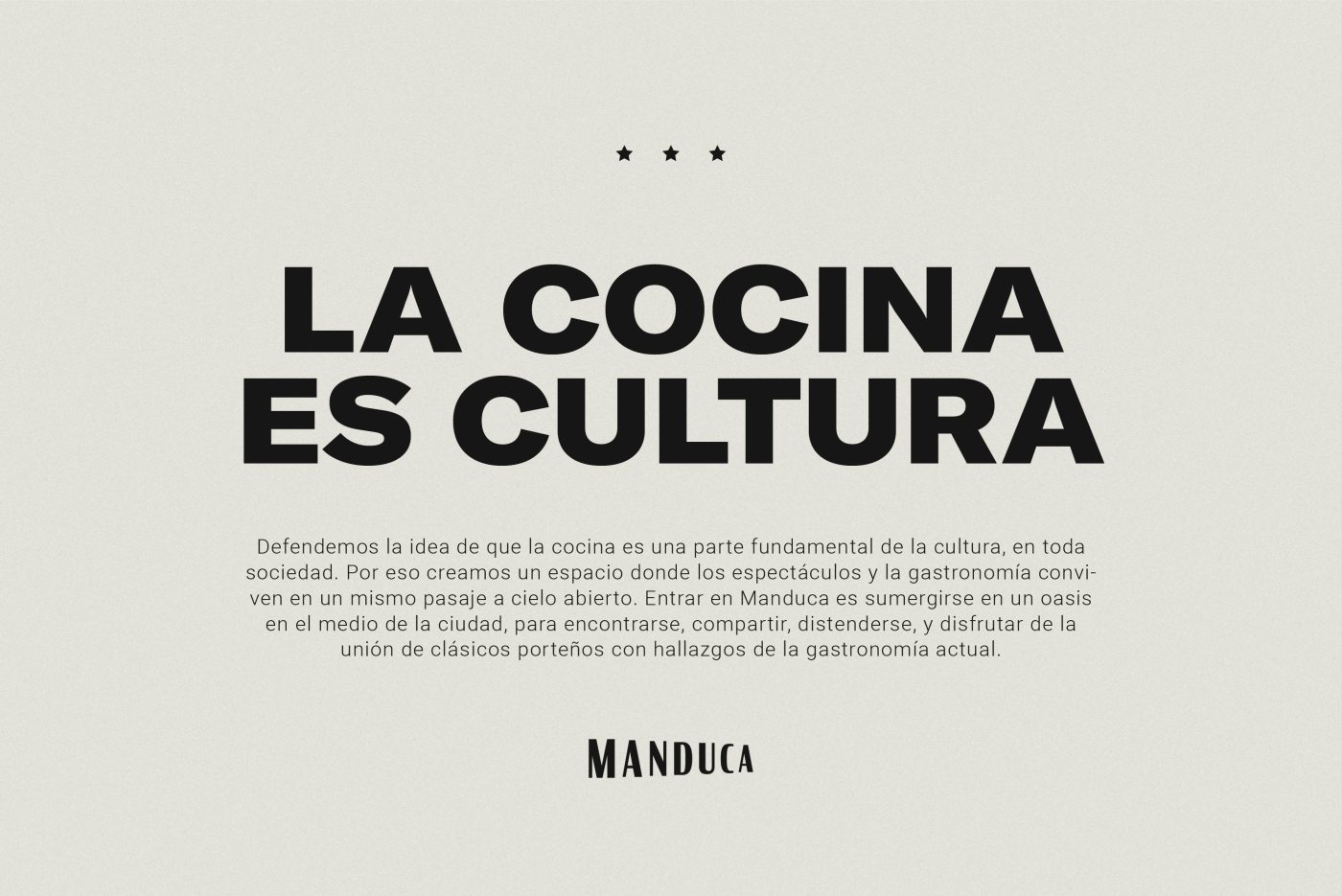
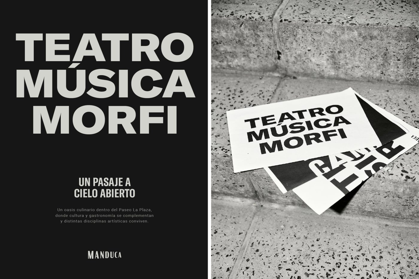
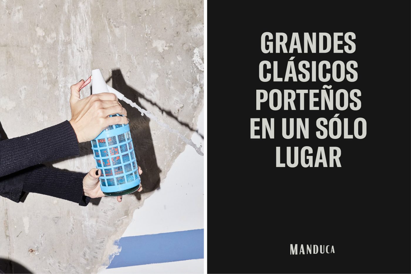
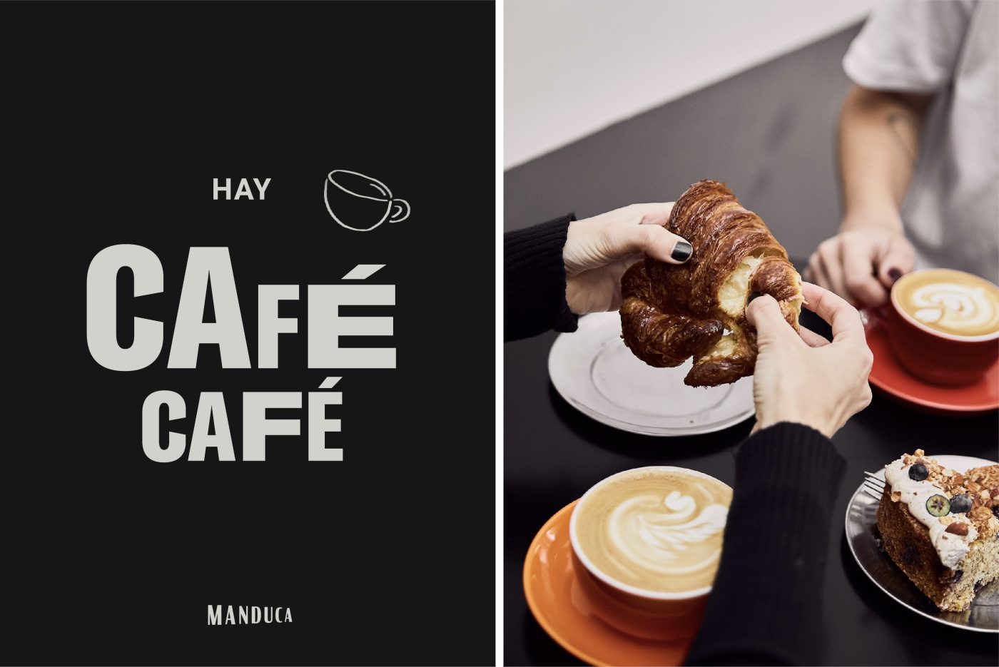
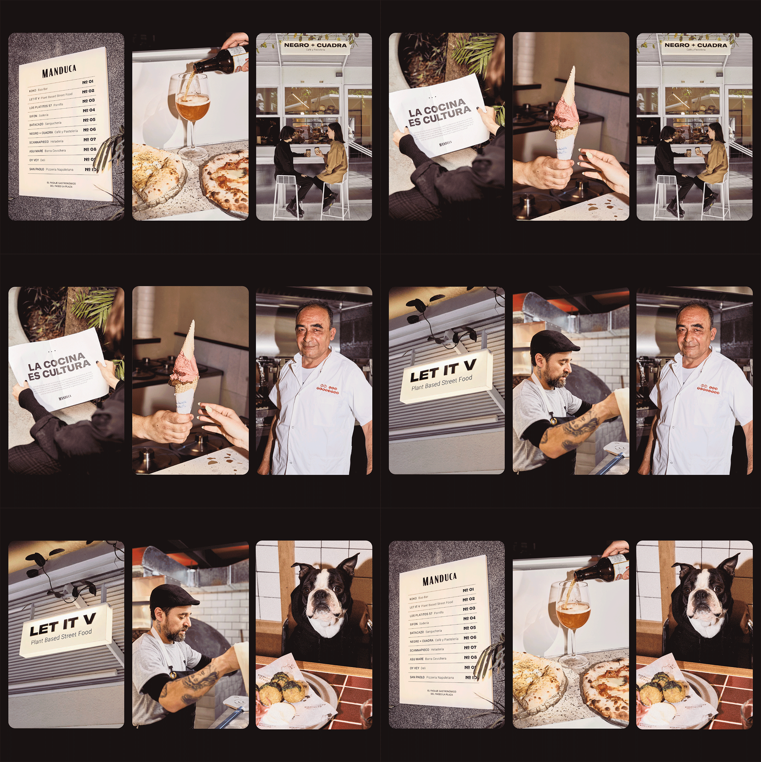
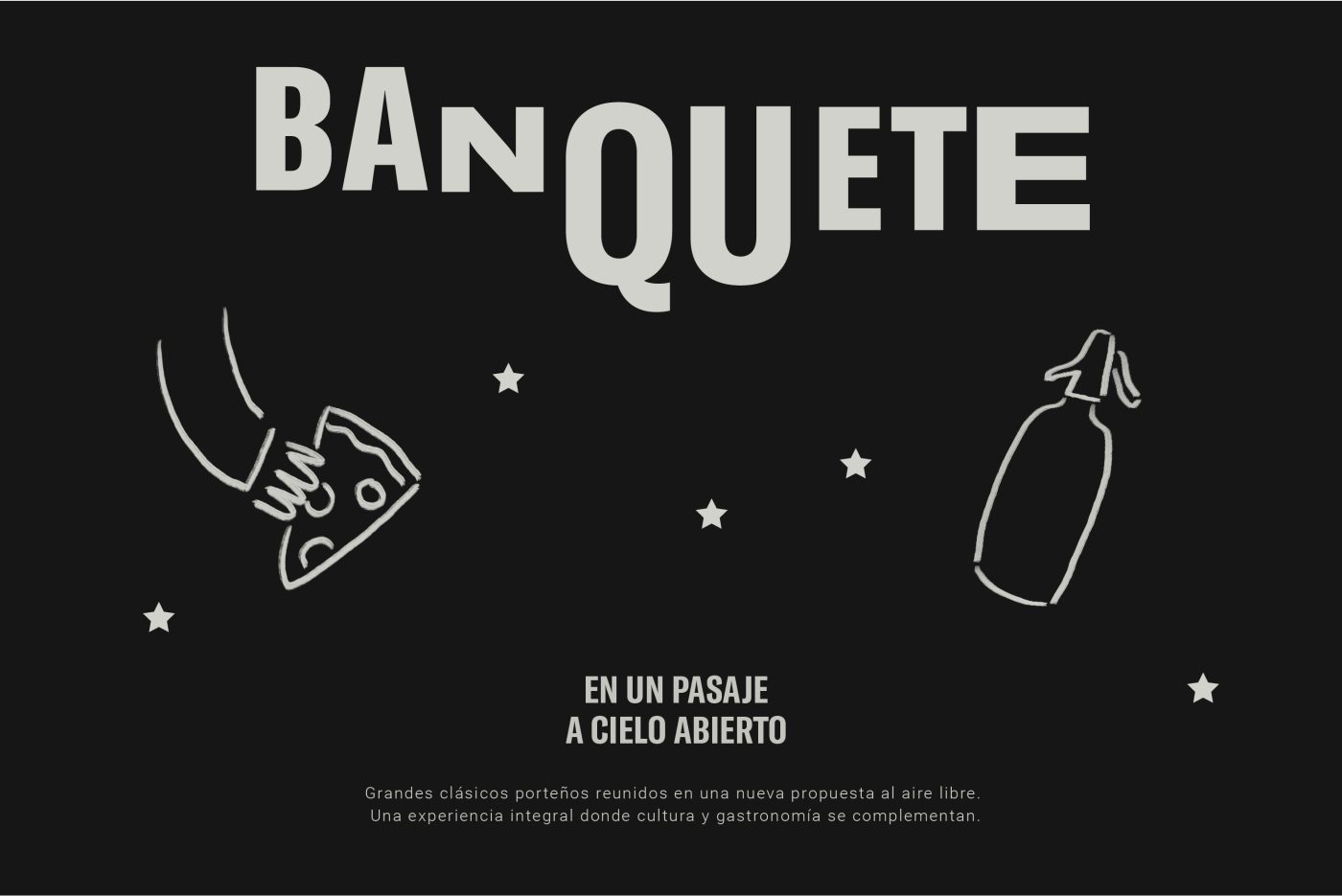
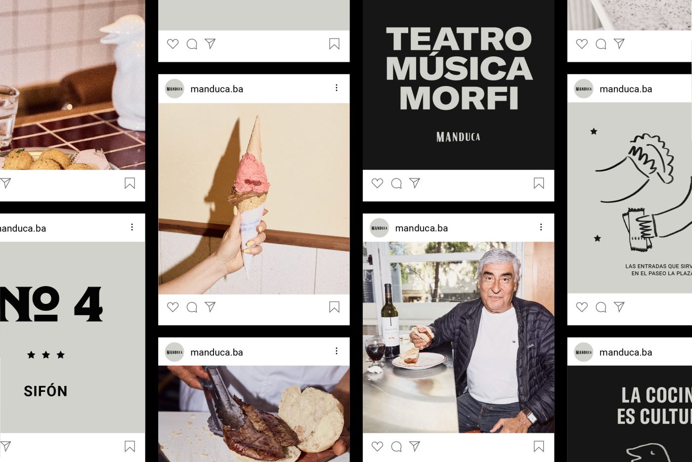
What we proposed was to unite theater and gastronomy in a playful way, with a simple, close and smart name: the word manducar comes from the Latin manducāre, which means to chew. We projected an identity with a wink towards the “porteño” that would respect our idiosyncrasy and update it at the same time. We took classic elements from “Avenida Corrientes” such as the penguin-jug, wine, soda, pizza and coffee, portrayed with a contemporary visual language. We used a heavy typeface with a lot of personality for the numbers, which contrasts with the noble and classic sans serif that we chose for the rest of the graphic system. The final typographical touch is given by the intervention in the size and location of the letters, which gives the sensation that the words were being recited, as if they had different volumes, some even shouting. We got inspired by the world of entertainment/theatre to give Manduca a particular voice, a way of speaking brought from another era, with humor and a lot of “Buenos Aires” personality. We used two colors, black and a dirty/warm white, to fulfill the premise that Manduca is a mother brand, able to encompass very varied proposals, from Los Platitos to Let it V, Koko or San Paolo.
